Line of Enquiry
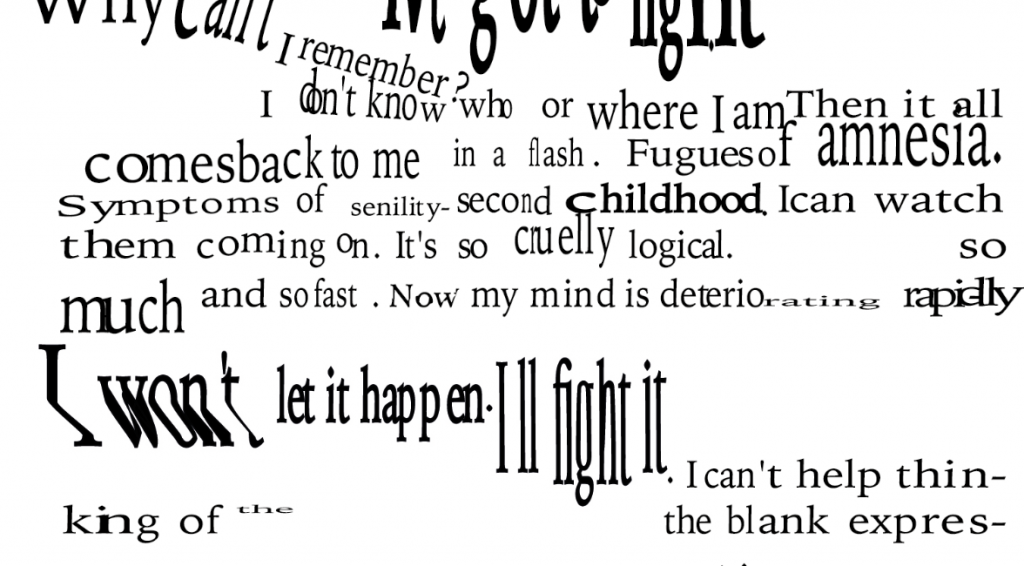
This project investigates whether typographic form can function as a record of reading rather than a vehicle for content. Using a fixed text, a diary entry from Daniel Keyes’ Flowers for Algernon, the work applies typographic parameters (weight, horizontal scale, leading, tracking, font size, rotation) to document one reader’s encounter with it.
The reader’s relationship to this text is shaped by personal experience: watching a grandmother lose the ability to communicate through language due to Parkinson’s disease. This experience becomes a filter through which the text is read and through which typographic choices are made. The project follows Barthes’s argument that every reading is a projection, and Benjamin’s position that translation always carries the translator’s presence. The reader’s subjectivity is not a distortion of the text but its subject.
The work unfolds in three movements: an initial accumulation of emotional weight as reading begins; the eruption of a repeated phrase that overruns the text; and a gradual retreat into childhood memory. The central question is: should type be read, or felt?
Annotated Bibliography
1. Walter Benjamin, ‘The Task of the Translator’
Illuminations, New York: Schocken Books, [1923] 1969, pp. 69–82 (Topic: theme/subject matter)
Benjamin argues that translation is not a transparent transfer of meaning but always carries the presence of the translator. The original passes through a new body, and that body leaves its mark. This frames the project’s use of an existing text: the typographic iterations are a form of translation in which the translator’s experience, watching a family member lose language to Parkinson’s disease, is necessarily present. The mark of the reader is the work.
2. Ed Fella, Letters on America
New York: Princeton Architectural Press, 2000 (Critical position)
Fella’s work documents a personal typographic language developed over decades of lettering studies, shaped entirely by his own sensibility rather than any external system or rule. Letters on America demonstrates that a subjective, idiosyncratic approach to letterform is a legitimate and rigorous design practice. This project follows that position: the typographic choices are not random but are specific to one reader’s experience, constituting a language of reading rather than a system of design.
3. Raymond Queneau, Exercises in Style
London: John Calder, [1947] 1998, pp. 9–16, 19–26 (Course reading list: broader discourse)
Queneau’s book retells the same banal incident ninety-nine times, each in a different literary style. The content never changes; the form changes everything. This is the direct literary precedent for the project’s iterative approach: one fixed text, processed repeatedly through different typographic parameters. Queneau demonstrates that formal variation is not decoration but meaning-making. How something is written determines what it does to a reader.
4. Michael Rock, ‘Fuck Content’
Multiple Signatures: On Designers, Authors, Readers and Users, New York: Rizzoli, [1996] 2013, pp. 45–56 (Course reading list: broader discourse)
Rock argues that graphic design’s content is not what it depicts but how it presents. Form does not serve content; form is content. This directly supports the project’s central question: if form is content, then typographic parameters are not neutral carriers but active producers of meaning. What the typography does to a word matters as much as what the word says.
5. Johanna Drucker, Diagrammatic Writing
Eindhoven: Onomatopee, 2013 (Medium/method)
Drucker’s artist book demonstrates that the visual and spatial organisation of text is inseparable from its meaning. Format is not neutral. In this project, each typographic decision, the weight, scale, and position of words on the page, is not an aesthetic choice applied after the fact but the primary site where meaning is made. The typography does not illustrate the reading; it is the reading.
6. David Carson, The End of Print
London: Laurence King, 1995 (Wild card)
Carson’s work established experimental typography as a legitimate expressive practice, using distorted letterforms and broken legibility not as failure but as content. His work demonstrates that the threshold of readability is meaningful territory. This project engages with that precedent but narrows it: where Carson’s distortions are often generalised and provocative, the choices here are specific to one reader’s response to one text. The distortion is not a style; it is a record.
Leave a Reply